目录
- 一、可视化介绍
- 二、可视化库介绍
- 三、Echarts
- Echarts引入和使用
- 了解基础配置
一、可视化介绍
- 可视化:将数据用图表展示出来,让数据更加直观、让数据特点更加突出
- 应用场景:营销数据、生产数据、用户数据
二、可视化库介绍
常见的数据可视化库:
- D3.js:目前 Web 端评价最高的 Javascript 可视化工具库(入手难)
- ECharts.js:百度出品的一个开源 Javascript 数据可视化库
- Highcharts.js:国外的前端数据可视化库,非商用免费,被许多国外大公司所使用
- AntV:蚂蚁金服全新一代数据可视化解决方案等等
- Highcharts 和 Echarts 就像是 Office 和 WPS 的关系
ECharts:一个使用 JavaScript 实现的开源可视化库,可以流畅的运行在 PC 和移动设备上,兼容当前绝大部分浏览器(IE8/9/10/11,Chrome,Firefox,Safari等),底层依赖矢量图形库 ZRender,提供直观,交互丰富,可高度个性化定制的数据可视化图表
三、Echarts
Echarts引入和使用
下载echarts(库) 引入文件到html页面中
<script src="./src/echarts.js"></script>准备一个DOM容器
<style>
    .box {
		width: 400px;
		height: 400px;
		cursor: pointer;
	}
</style>
<div class='box'></div>
初始化一个echarts对象
var box = document.querySelector(".box")
var echarts1 = echarts.init(box)
指定配置项和数据
var option = {
	title: {
		text: 'ECharts 入门示例'
	},
	tooltip: {},
	legend: {
		data: ['销量']
	},
	xAxis: {
		data: ['衬衫', '羊毛衫', '雪纺衫', '裤子', '高跟鞋', '袜子']
	},
	yAxis: {},
	series: [{
		name: '销量',
		type: 'bar',
		data: [5, 20, 36, 10, 10, 20]
	}]
}
将配置项设置给echarts实例对象
echarts1.setOption(option)了解基础配置
title:标题组件,包含主标题和副标题
tooltip:提示框组件
legend:图例组件
series
系列列表:每个系列通过 type 决定自己的图表类型
xAxis:直角坐标系 grid 中的 x 轴
boundaryGap: 坐标轴两边留白策略 true,这时候刻度只是作为分隔线,标签和数据点都会在两个刻度之间的带(band)中间
yAxis:直角坐标系 grid 中的 y 轴
grid:直角坐标系内绘图网格
color:调色盘颜色列表
注:不要求全部记忆,只需要知道怎么在官方文档上查找学习
官方文档:Documentation - Apache ECharts
(1)示例:标题组件title
              title: {
					show: true,          //是否显示标题组件
					text: '主标题',
					link: "http://www.baidu.com",   //主标题文本超链接
					textStyle: {                   //主标题的文本样式 相当于css的
						color: "blue",
						fontWeight: "100"
					},
					subtext: "副标题",
					subtextStyle: {               //副标题的文本样式
						color: "red",
						fontWeight: "100",
						fontSize: "20px"
					},
					textAlign: "auto",         //整体(包括 text 和 subtext)的水平对齐
					textVerticalAlign: "auto", //整体(包括 text 和 subtext)的垂直对齐
					padding: [5, 10],          //标题内边距
					left: 400,                 //title 组件离容器左侧的距离
					backgroundColor: "yellow"   //标题背景色,默认透明
				},
(2)示例:工具组件toolbox
                toolbox: {
					//配置工具
					feature: {
						mytool: {    //自定义的工具名字,只能以 my 开头
							show: true,
							title: "自定义扩展方法",
							icon: "image://https://img2.baidu.com/it/u=1814268193,3619863984&fm=253&app=138&size=w931&n=0&f=JPEG&fmt=auto?sec=1658941200&t=d5f42a41eab8af5c9929fcc6f9e1eff7",
							onclick: function() {
								console.log("点击事件")
							}
						},
						saveAsImage: {
							name: "保存"
						},
						restore: {      //配置项还原
						},
						dataView: { //数据视图工具,可展现当前图表所用的数据,编辑后可动态更新
						},
						dataZoom: {},    //数据区域缩放
						magicType: {      //动态类型切换
							type: ['line', 'bar', 'stack']
						}
					}
				},
(3)示例:提示框组件tooltip
            tooltip: {
					show: true,
					trigger: "axis", //触发类型 "none"||"axis"
					showContent: false,   // 是否显示提示框浮层
					alwaysShowContent: true,  //是否永远显示提示框内容
					triggerOn: "click",         //提示框触发的条件
					backgroundColor: "gold",
					textStyle: {
						color: "white"
					},
					axisPointer: {     //是配置坐标轴指示器的快捷方式
						type: "cross",  //指示器类型 line shadow none cross
						axis: "x",      //指示器的坐标轴
						snap: true,     //坐标轴指示器是否自动吸附到点上
                        label: {        //坐标轴指示器的文本标签
							show: true,
							color: "red",
						 	formatter: ({    //文本标签文字的格式化器
						 		value
						 	}) => {
								console.log(value)
						 		return `--${value}` //value*2
						 	}
						 }
					}
				},
(4)示例:图例组件legend
legend: {
					type: "scroll",     //图例的类型 plain普通图例 scroll可滚动翻页的图例
					orient: "vertical",  //图例列表的布局朝向 vertical horizontal
					data: [{
						name: '销量1',   //图例项的名称
						icon: "circle",   //图例项的 icon
						itemStyle: {
							color: "red"
						}
					}, {
						name: '销量2',
						icon: "rect",
						itemStyle: {
							color: "red"
						}
					}, {
						name: '纯利1',
						icon: "triangle",
						textStyle: {
							color: "red",
							fontSize: "20px"
						}
					}, {
						name: '纯利2',
						icon: "path://",   //'path://' 将图标设置为任意的矢量路径
						icon: "image://url",       //通过图片链接设置为图片
						icon:  "image://https://img2.baidu.com/it/u=1814268193,3619863984&fm=253&app=138&size=w931&n=0&f=JPEG&fmt=auto?sec=1658941200&t=d5f42a41eab8af5c9929fcc6f9e1eff7"   //通过图片编码设置为图片
					  }]
				   },
(5)示例:系列列表series
              series: [{
					name: "某某系列1",
					type: 'line',
					colorBy: "series", //按系列分配调色盘中的颜色,同一系列中的所有数据都是用相同的颜色
					symbol: "rect",     //标记的图形 设置拐点
					cursor: "move",
					label: {
						show: true    //是否显示标签文字
					},
					endLabel: {       //折线端点的标签
						show: true
					},
					labelLine: {
						show: true,   //是否显示连接线
						smooth: true    //是否平滑
					},
					lineStyle: {       //标签的视觉引导线配置
						color: "red",
						width: 2,
						join: "miter"  //设置2个长度不为0的相连部分如何连接在一起的属性
					},
					smooth: 0.3,
					data: [420, 432, 401, 434, 190, 130, 120],
				}, {
					name: "某某系列2",
					type: 'line',
					symbol: "arrow",
					symbolSize: 10,     // 拐点大小
					data: [860, 962, 961, 964, 1260, 1360, 1360],
				}]
			};
(6)示例:直角坐标系 grid 中的 x、y轴(类似)
 xAxis: {
     show: true;  //是否显示x轴
     data: ['衬衫', '羊毛衫', '雪纺衫', '裤子', '高跟鞋', '袜子']   //类目数据,在类目轴
     position:'top'   //x轴的位置
     name:'坐标轴的名称'
     axisTick: {
         show: false // 去除刻度线
     },
     axisLabel: {
         color: '#4c9bfd' // 文本颜色
     },
     axisLine: {
         show: false // 去除轴线
     },
     boundaryGap: false  // 去除轴内间距
 },
(7)蓝丁格尔玫瑰图
<style>
    .box {
      width: 500px;
      height: 500px;
    }
</style>
<div class="box"></div>
<script>
    var box = document.querySelector(".box")
    var ect = echarts.init(box)
    option = {
      title: {
        text: 'Nightingale Chart',
        subtext: 'Fake Data',
        left: 'center'
      },
      tooltip: {
        trigger: 'item',
        formatter: '{a} <br/>{b} : {c} ({d}%)'
      },
      toolbox: {
        show: true,
        feature: {
          mark: {
            show: true
          },
          dataView: {
            show: true,
            readOnly: false
          },
          restore: {
            show: true
          },
          saveAsImage: {
            show: true
          }
        }
      },
      series: [{
        name: '面积模式',
        type: 'pie',
        radius: [30, 110],
        center: ['25%', '50%'],
        roseType: 'radius',
        color: ['#006cff', '#60cda0', '#ed8884', '#ff9f7f', '#0096ff', '#9fe6b8', '#32c5e9', '#1d9dff'],
        itemStyle: {
          borderRadius: 5
        },
        label: {
          show: false,
          fontSize: 10
        },
        emphasis: {
          label: {
            show: true
          }
        },
        labelLine: {
          // 连接扇形图线长
          length: 6,
          // 连接文字线长
          length2: 8
        },
        data: [{
            value: 20,
            name: '云南'
          },
          {
            value: 26,
            name: '北京'
          },
          {
            value: 24,
            name: '山东'
          },
          {
            value: 25,
            name: '河北'
          },
          {
            value: 20,
            name: '江苏'
          },
          {
            value: 25,
            name: '浙江'
          },
          {
            value: 30,
            name: '四川'
          },
          {
            value: 42,
            name: '湖北'
          }
        ]
      }, ]
    };
    ect.setOption(option)
</script>
效果图:
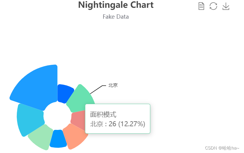
到此这篇关于JavaScript可视化与Echarts详细介绍的文章就介绍到这了,更多相关JavaScript可视化与Echarts内容请搜索我们以前的文章或继续浏览下面的相关文章希望大家以后多多支持我们!
本站部分内容来源互联网,如果有图片或者内容侵犯您的权益请联系我们删除!